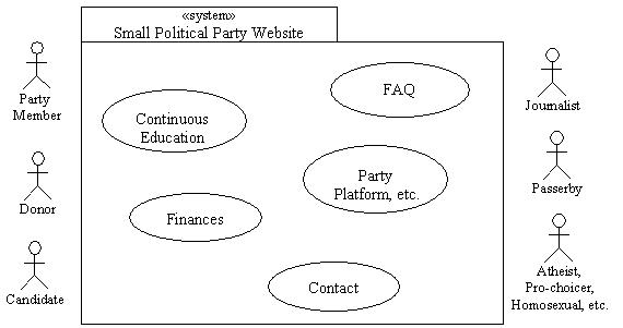
Warning! This diagram has nothing to do with the visual appearance of the site!
It's a draft of a Use Case Diagram (See #2 here below).
Let's Adore Jesus-Eucharist! | Home >> Politics

Warning! This diagram has nothing to do with the visual appearance of the site!
It's a draft of a Use Case Diagram (See
#2 here below).
I don't really know how to make a web site for a political party, but I've been designated a member of a committee tasked with doing just that. So here is my best attempt. Please tell me if there is a better way.
Let's start with some typical "use cases", or ways people will use this web site:
2.1) Voter trying to contact his democratic representative. This whole thing about web sites and political parties is supposedly to improve our democracy. But if the average voter can't easily get in contact with his elected official (or candidate trying to get elected, or his riding association, etc.), then something is seriously wrong!
2.2) Passerby clutching a flyer. A simple way for a political party to make itself known, is to go to various gatherings and hand out nice color flyers. When they get home, some of these passerbys will be curious, and go on the Internet to find out more about this "mysterious political party whose flyers are handed out by such well-dressed and polite young people". The web site has to quickly interest these visitors, and briefly explain what the party stands for.
2.3) Journalist looking for a soundbite. When some event occurs, journalists try to find spokespersons who have very diverse points of view, who are easy to reach, who represent as many citizens as possible, who express their opinion briefly and clearly, etc. The web site has to let such journalists quickly find a summary of our opinion on current events, and get in touch with a representative.
2.4) Brain-washed zombie looking for something to hate. Whether we like it or not, many young persons out there have been "brain-washed" into hating Christ and his Church. These people (often atheists, or pro-choicers or homosexuals) actually seek out Christian web sites, just to find things to disagree with. The web site has to welcome these people with open arms, and politely and gently explain what we all have in common, and why we disagree with them on certain topics.
2.5) Eager newbie wanting to become a member. When someone becomes convinced that joining our Party is a good idea, the web site has to make the process as easy as possible (satisfying the eligibility criteria, making the pledge, sending registration information and money, etc.)
2.6) Candidate or simple member getting training. One of the distinguishing features of our political party is of course the online training curriculum, so all members and candidates can fulfill their promise of continuous education. The web site has to provide the reading lists, the exercices and maybe even the little online exams to encourage people to always learn more about Politics, Ethics, Economics, Philosophy, etc.
2.7) Donor looking for where his money went. Anybody can take money and make it disappear (just think of our current Government!). What is difficult is to accept donations, then tell donors exactly how their money was spent. We have nothing to hide, so our financial spreadsheets should be on our web site, including little comments like: "Coffee for September: paid by Mr. Spencer's donation #3525", or "Monthy fees for the web site paid for by the Johnson Family, and Ed Smith. Thanks!", etc.
Etc., etc...
In order to provide the typical use cases listed above, many problems need to be solved. I can think of at least four. To try to explain them, let's use the metaphor of a house:
3.1) Who lives in that house. The most important part, the actual contents (especially the party platform). See #4 below.
3.2) Who answers the door. You don't necessarily want the same person to answer whether it's the mailman, the fireman, an annoying salesman or your mother-in-law! Same thing for a web site: access to the contents has to be organized in a way appropriate for various typical "clients" (see use cases above).
3.3) The roof trusses, plumbing, wiring, etc. The actual programming of the web site. This is relatively easy to solve.
3.4) The paint, curtains, decorations, etc. The esthetics of the web site (which I consider very unimportant, but which many people use to decide whether to go on a web site or not). If #3.3 here above is well done, the esthetics can be gradually improved.
Point #3.1 above is the hardest problem to solve. In order to try to see this, let's switch metaphors and talk about a car. If you claim you're a good car mechanic and that you can fix this client's car, that means:
4.1) You know all the problems of this car. You are able to make a list of everything that needs to be fixed, in decreasing order of importance. (For politics, you need to know all the problems of your country, whether demographic, economic, legal, constitutional, geopolitical, etc.)
4.2) You know how to fix all these problems. For each problem, you must know what steps need to be taken to fix it. (For politics, this is not easy either! It's basically the party platform.)
But, if you are telling the truth, the preceding two items imply the following two other items:
4.3) Actually, you know how to fix just about any car. If there is a sign on your building saying: "Garage", what you are saying to potential clients is that you can probably fix any car.
4.4) You thoroughly understand how cars are manufactured and how they work. To fix something, you need to know it inside out. A professional car mechanic will have an abundance of "background" knowledge which guides his actions. (For Politics, this means you have good knowledge of government, economics, taxation policies, health care systems, education, etc.)
This is not a trivial task! I have never seen or heard of a web site, for any political party, that actually provided this content (even though they all should).
What is even more insulting is when one ends up on the web site of a small political party which doesn't even realize how enormous the task is! At the very least, we should have the humility of admitting our ignorance, and show that we're doing everything we can to educate ourselves!
We haven't done anything yet, but hopefully we're more aware of just how complicated it is to make a good web site for a political party. We'll try to get more practical in "Part 2" of this series.
Let's Adore Jesus-Eucharist! | Home >> Politics