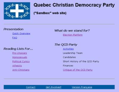
Sandbox website for the QCD Party. 2006-May-21.
Let's Adore Jesus-Eucharist! | Home >> Politics

Sandbox website for the QCD Party. 2006-May-21.
Note: Warning, this text won't make sense unless you've read the first part.
Unfortunately, I don't have a cookbook method to build a good web site for a political party. After having given a few very general rules, I suggest here a few more practical rules, concerning content, access, programming and esthetics.
See "A Generic Catholic Election Platform" for the most important part of the contents.
A few other rules concerning the contents:
2.1) The electoral platform must exist. By definition, when you ask all voters to vote for you, i.e. to entrust you with one of the most important things in the world (their country, province, city, etc.), you're supposed to know what to do! It's one of the most important rules, and one of the least respected. If your political party doesn't have an excellent electoral platform on its web site, then your political party should be investing all its efforts to write this platform! Otherwise, don't waste your time fiddling around with a web site; change parties or go start up a new one!
2.2) The contents must be very stable. A web site for a political party is almost the exact contrary of a blog. A blog, basically, is one single person who thinks out loud on the Internet. That person posts what she wants, when she wants, and without worrying too much whether what she's saying is really true or not. But a political party web site must present positions that are very solid, based on serious reflections, careful research efforts in Philosophy and Politics, intelligent debates, and these positions should have been prepared by transitory publications letting these ideas be circulated and vetted. If the contents of the web site (especially the electoral platform) change with the wind, that party isn't serious.
2.3) The contents must be the result of a carefully maintained consensus. By definition, advocating a political party means we agree with what that party stands for. If a political party wants to chase people away, all it has to do is fiddle with the contents of the web site without approval by the candidates, members and supporters. Change without consent is like pulling the rug out from people's feet.
2.4) The official site should be copied on a "sandbox site". Since the site contents must be very stable and approved by the majority, it seems to me preferable to have two web sites: an official web site know by the general public, and a "sandbox site" where the web site committee can make experiments, temporarily integrate the member's suggestions, facilitate discussions on such and such a draft policy, etc. At some point of time, you can send an e-mail to all candidates, members and supporters to ask them to scrutinize the "sandbox site", and maybe vote online to say if they approve or not. If it's approved, the "sandbox site" becomes the new official site. You then do a "Copy-Paste" of the new official web site, in order to start a new "sandbox site", and the improvement cycle begins anew. In my opinion, the "sandbox site" doesn't need to be very secret, since on each page it's clearly said that: "This site is only a "sandbox"! The official party web site is here on the Internet!", etc.
A few rules about organization of access:
3.1) The home page must give a direct access to the main contents. I guess there should be a rough limit of seven items on the home page, the most important:
- the electoral platform;
- the items of #3.2 here below;
- the items of #3.3 here below.
3.2) Some things must be accessible from anywhere on the site. For example, at the bottom of each page, you can have little links to:
- the home page;
- the equivalent French page to the one you're currently on
(French, or whatever other official languages of your party);
- the contact information page (by phone, e-mail, snail-mail, etc.);
- maybe also a site map, also "bread crumbs" which indicate where you are on
the site, and perhaps also a "Act Now!" kind of link (after all, the reason you
have a web site is to entice people into engaging in politics, so if a little
flame is kindled in their heart, you have to shield it and fuel it as quickly
as possible!);
- Etc.
3.3) The web site must be summarized at least twice. I feel like saying there are two types of visitors on the web site of a political party: those who are in a hurry, and those who are in a big hurry! There should be at least two "levels" of overview, a "one-minute overview", and a "dozen-minute overview". (For example, on my personal web site, I have a quick Overview. and a more detailed FAQ.)
3.4) The site must offer reading lists to your opponents. By definition, not everybody agrees with a political party, otherwise it would be called a political "whole", not a "party"! In order to get elected, you must successfully persuade many people who don't currently agree with you. One way of doing this is to offer "reading lists" which are tailored to various "target audiences":
- people who are cynical about Politics;
- people who gag when they hear the expression
"Christian democracy";
- pro-choicers;
- homosexual persons;
- Muslims;
- atheists;
- people who vote for such and such another party (for each other party,
we have to explain why they should stop voting for them);
- Etc.
3.5) These reading lists must be very easy to access. When you are debating in the street with strangers, you want to be able to grab any one of your party's paper documents and scribble a "slashtag" after the web site address, to prescribe the right intellectual and moral medication.
Imagine your web site was called "www.SomeGoodParty.pol", you might have some slashtags like:
www.SomeGoodParty.pol/abortion
www.SomeGoodParty.pol/sodomy
www.SomeGoodParty.pol/islam
www.SomeGoodParty.pol/atheism
www.SomeGoodParty.pol/tyranny
(Ask your webmaster to add "shortcuts" to the reading lists, using the "Redirect" command in the ".htaccess" file. It's very easy.)
3.6) Ease of access should probably be biased toward newbies and opponents. You can't put links to everything on your home page. Since some things are going to have to be "buried", it's probably a good idea to make your experienced supporters work harder, than newbies and opponents who don't have much patience.
Etc., etc...
For HTML programming as such, see "HTML For Grannies".
For more general programming rules, see Sections 2 and 3 of A Few Software Rules For This Web Site.
A few other rules:
4.1) The webmaster must be easy to replace. It's ridiculous for a political party's web site to be down for days, or even complete weeks, just because the webmaster is sick, or that he quit in disgust, etc.! (See especially #3.2 in A Few Software Rules For This Web Site to reduce the probability of such a situation occurring).
4.2) The webmaster must not be a bottleneck. The few rare documents which must change often and independently should be uploadable by people who are responsible for them. Some examples: "The news blog", or "The financial spreadsheet", or "The minutes of the executive committee's meetings", etc. Basically, your ISP can set up special folders for you, each having their own username and password. The hyperlinks to those documents never change, so the webmaster is out of the loop.
I'm a hopeless loss for esthetics. A few common sense suggestions:
5.1) Get professional help. Ask for portfolios, examples of web sites that these people consulted on, and chose the best.
5.2) Read good books on the topics. See among others the books by Ben Shneiderman or Jeff Johnson in "Some Good Software Engineering Books"
5.3) Visit good-looking web sites. Simply by keeping your eyes open and taking notes, while visiting many web sites, can help you get closer to a solution.
But if you ask for my personal advice, after years in politics, I'd say the best way to improve the esthetics of such a web site is:
5.4) Nice pictures of real members; good videos of debates against worst enemies. I don't like to see pictures of young and pretty people who are just paid to be there, and who would never vote for this party! I'd rather see pictures of ordinary members of the party doing extraordinary things. (For example, a picture of a mother and her kids kneeling in prayer in front of an abortion mill, or a picture of a couple of well-dressed young hemen handing out flyers for the party in front of a mosque, or in front of the CBC building, etc.)
In the same line of thought, videos of party "talking heads" who repeat what is written on the web site don't interest me. But videos of real debates, where we see the arguments of the party's worst enemies being sliced and diced, now that grabs my attention!
A good web site is an essential component of any good political party. With the preceding pieces of advice, you have enough information to build one yourself!
Let's Adore Jesus-Eucharist! | Home >> Politics